
Paint conversion charts never match exactly because the paints themselves were never designed to match. Two different manufacturers formulate their reds, greens, and browns independently, using different pigments and binders, so the closest available color in another brand is an approximation of the original, not a duplicate of it. A chart can only report how close that approximation is. It cannot make the paints identical.
Different pigments produce different colors
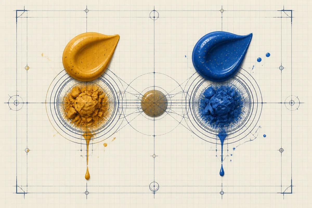
Two paints that look similar in a photo can be built from entirely different pigment combinations. A red might be a single pigment in one brand and a blend of two or three in another, chosen for cost, opacity, or lightfastness rather than to match a competitor's exact shade. Those pigment differences show up in how the paint behaves once thinned, layered, or shaded, even when the base color reads as close.
Batch variation exists within a single paint
Even the same paint from the same brand can shift slightly from batch to batch, since pigment sourcing and manufacturing tolerances are never perfectly identical run to run. That means the "official" color of a paint is really a narrow range, not one fixed value, which sets a hard floor on how exact any cross-brand match can ever claim to be.
Screens and printed swatches are not the paint
A chart's swatch, whether printed or shown on a screen, is itself an approximation of the real paint. Monitors vary in calibration, printers vary in ink and paper, and lighting when a photo was taken all shift how a color reads. Comparing two swatches is really comparing two representations of paint, one step removed from the paint itself, which adds another layer of possible drift on top of the actual pigment difference.
Application changes the outcome too
The same paint looks different depending on how thick it goes on, what primer sits underneath, how many coats were used, and how it was thinned. A chart necessarily shows one application under one set of conditions. Your model, painted with your primer, your thinning ratio, and your lighting, will never be pixel-identical to a reference swatch even using the exact same paint, let alone a matched one from another brand.
| Source of drift | What it affects |
|---|---|
| Pigment formulation | The base color and how it behaves under a wash or highlight |
| Batch to batch variation | Small shifts even within one paint over time |
| Screen or print reproduction | How accurately the swatch represents the real paint |
| Primer and application | The final look on your specific model |
What this means for using a match
None of this makes conversion charts or matching tools useless; it sets realistic expectations. A high similarity score means the approximate stored swatches are close under the site's formula, not that the physical paints are visually or chemically identical. Use high-scoring same-finish results as candidates, then compare the actual dried paints before substituting or adjusting a mixture.
FAQ
Why do two paints with the same hex code still look different in person?
A hex code stores one digital color value. Its source may be a community catalog, product image, photograph, scan, or another reference, and it does not capture the physical paint's pigment, finish, or changing reflections.
Is it possible for a paint chart to ever be 100 percent accurate?
Not in the sense of guaranteeing an identical result on every model. Source swatches, screen reproduction, batch variation, primer, and application can all introduce differences that a digital score does not establish or control.
Does this mean I shouldn't trust conversion charts at all?
No. A well-built chart or matching tool can narrow a catalog more consistently than guessing. A high digital score still needs a finish check and, when the match matters, an actual paint test.
Why does the same paint look different on my model than on the manufacturer's box art?
Box art is typically shot under studio lighting with a specific primer, application, and often extra editing, none of which matches your desk lighting, primer choice, or brush technique.