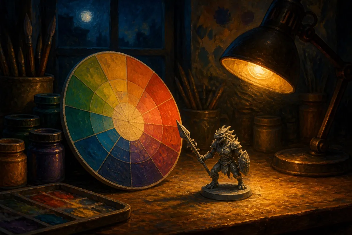
Color theory for miniature painting comes down to three working ideas: hue (what family a color belongs to), temperature (whether it reads warm or cool), and contrast (how colors relate to each other on the color wheel). You do not need art school to use this. Knowing that orange and blue sit opposite each other on the wheel, and that pairing them makes both pop, is enough to plan a scheme that reads well from across a gaming table instead of looking accidental.
What is the color wheel, in practical terms?
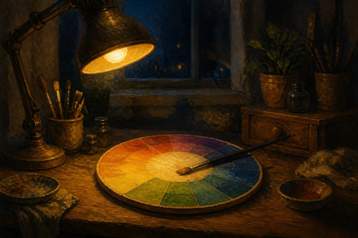
The color wheel arranges hues in a circle: red, orange, yellow, green, blue, and purple, with every shade you can mix sitting somewhere between two of those anchors. Colors next to each other on the wheel, like red and orange, are analogous and blend into each other smoothly, which is why a lot of fire, blood, and rust effects use neighboring hues rather than a single flat color. Colors across from each other, like blue and orange, are complementary and create the strongest visual contrast, which is why armor trim, glowing eyes, and squad markings so often use a complementary accent against the main color.
Why do warm and cool colors matter on a miniature?
Warm colors (reds, oranges, yellows) tend to advance toward the viewer and read as active or aggressive. Cool colors (blues, greens, purples) recede and read as calm or cold. A miniature painted mostly in cool armor with a single warm accent, like a red banner or an orange power source, draws the eye to that one spot because it is the only thing fighting the overall temperature of the model. This is the entire logic behind "spot color," a technique painters use constantly without necessarily naming it: pick one warm accent against a cool base, or the reverse, and let contrast do the work instead of piling on detail.
How do complementary colors work in practice?
| Base color | Citadel example | Complementary family | Citadel example | Effect on the model |
|---|---|---|---|---|
| Red | Mephiston Red | Green | Elysian Green or Moot Green | High contrast, reads as aggressive |
| Blue | Macragge Blue | Orange | Jokaero Orange | Classic sci-fi trim contrast |
| Purple | Phoenician Purple | Yellow | A bright yellow accent | Strong, unusual, good for standouts |
| Deep blue | Kantor Blue | Warm orange | Jokaero Orange | Reads as tech or energy source |
You do not need to hit an exact wheel opposite to get the benefit. Colors within roughly 30 degrees of true complementary still read as high contrast, which is why a painter can eyeball this instead of pulling out a physical color wheel mid-session. If you already own paint from more than one brand and want to check whether a color you have is close enough to a wheel-accurate complement, our paint conversion tool compares actual swatch hex values across every brand on this site, which is a faster check than guessing from memory.
Should a whole army share a temperature?
Most painted forces read best with one dominant temperature and one accent. An army painted entirely in warm reds and oranges with no cool relief looks flat and tiring to look at in large numbers, even if each individual model looks fine on its own. The fix is not to abandon the warm scheme, it is to pick one cool element, often the base or a single piece of equipment, and repeat it consistently across every model in the unit. That repetition is what makes a squad read as a coordinated force instead of a pile of individually painted miniatures.
Does value matter more than hue?
For readability at tabletop distance, yes. Value, meaning how light or dark a color is regardless of its hue, is what your eye actually parses first from a few feet away. Two colors can be different hues and still read as "the same" if they sit at nearly identical value, which is why highlight and shade steps within a single hue often do more for a model's visual clarity than adding a second, different-hued color. A scheme with strong value range, dark shadows to bright highlights within each color, will read clearly even before the viewer processes hue or temperature at all.
FAQ
Do I need to buy a color wheel to use any of this? No. Knowing the six-color wheel order (red, orange, yellow, green, blue, purple) from memory is enough to identify rough complements and neighbors without a physical tool.
What is the fastest way to add contrast to a flat-looking miniature? Add one small complementary accent, such as a different-hued gem, cloth, or trim piece, rather than repainting the whole model. A small high-contrast detail does more visual work than a large low-contrast one.
Are warm colors always better for "evil" factions and cool colors for "good" ones? That is a common convention in games and fiction, not a rule of color theory itself. Temperature communicates energy and mood, not morality, and plenty of effective schemes invert the convention deliberately.
Can I mix complementary paints together? Yes, but sparingly. Mixing near-complementary hues together in roughly equal amounts tends to gray out toward a neutral brown or olive, which is useful for muting a color but not for creating a clean third hue.
Does this apply to metallics too? Partially. Metallics still have an underlying hue (gold reads warm, steel reads cool) and respond to the same contrast logic, but their reflective quality means lighting in the room affects the read more than it does with matte paints.