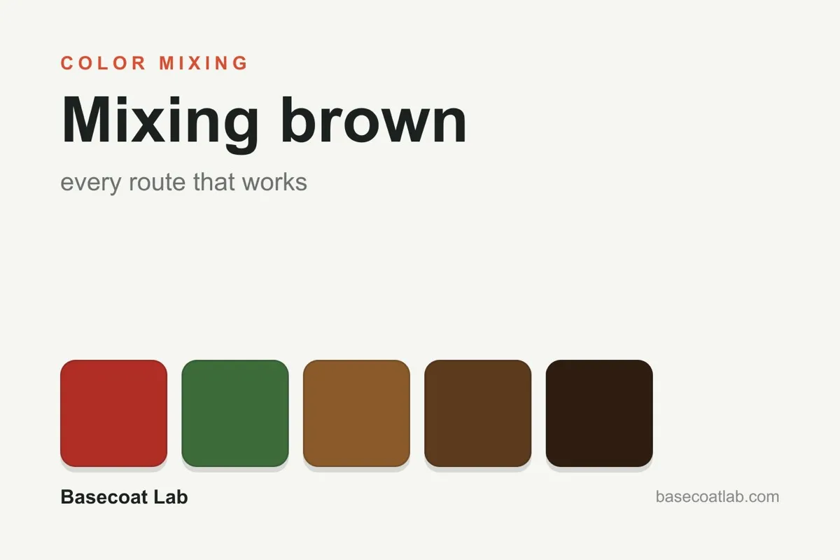
Brown isn't actually on the color wheel. This is why it is so easy to mix from almost any palette you have; every brown is essentially just a muted, darkened version of orange. The trick is to get enough orange tone first, then knock the intensity back. The three recipes below all follow that same basic logic.
The three recipes
1. Complementary pairs (the painter's default). If you mix a color with its direct opposite on the color wheel, the result collapses toward a brown-grey.
- Red + green produces warm chestnut browns.
- Orange + blue provides the most controllable range, spanning from leather tones to coffee.
- Yellow + purple tends to look like a muddy olive.
Start with a roughly 50/50 split and adjust as you go. Adding more of the warm color pushes the mix toward rust, while adding more of the cool color moves it toward taupe.
2. All three primaries. Mixing red, yellow, and blue in uneven parts will create brown because you are effectively making orange (red + yellow) and then muting it with blue. If you use heavy yellow, you get tan or ochre. A heavy red lean produces mahogany. If you add a lot of blue, the color drags toward sepia or even near-black.
3. Orange + black (the shortcut). This is the fastest method, but there is a catch: black can deaden the color as you add more, making the mixture look flat and cold. If you swap the black for dark blue instead, you keep the shadow color looking "alive." It is the difference between a muddy mess and a rich espresso.
Steering the result
Once you have your base brown, you can shift it in different directions:
- Warmer (leather, rust): add red or orange.
- Cooler (taupe, driftwood): add a touch of blue.
- Lighter (tan, buff): add yellow or bone. Using white alone often makes beige look chalky or pink.
- Richer/darker: add dark blue or purple rather than black.
Take the guesswork out
Ratios in physical paint rarely behave exactly like ratios in theory because pigment strength varies between different brands and bottles. The paint mixing calculator can preview a digital blend of two approximate catalog swatches, but it cannot show you exactly what the physical mixture will look like before you put it on your palette. It is always best to test a small amount first.
If the specific shade of brown you want might already exist in a pre-mixed bottle, the conversion charts can help you shortlist your options. There are catalog browns swatched across twelve different brands, starting from the Citadel paint chart.
Why mixing brown matters on miniatures
Brown is the workhorse of tabletop painting. You need it for leather straps, wooden hafts, mud bases, hair, and rust. A model might get away from purple for a while, but it cannot dodge brown. Learning how to mix a consistent brown from any base set, and being able to repeat that exact color next session, which is where a wet palette is useful, is one of the most important mixing skills you can develop.